
Design system · designed and built by meDesignsysteem · zelf bedacht en gebouwd
Nacre
One visual language for my site and my apps: dark first, lime as the only primary, mother-of-pearl red as accent, and glass you can see through. This whole page is built from it.
Eén visuele taal voor mijn site en mijn apps: donker eerst, lime als enige primaire kleur, parelmoer rood als accent, en glas waar je door kijkt. Deze pagina is er volledig uit opgebouwd.
Tokens
240+
ComponentsComponenten
21
ThemesThema's
Dark + lightDonker + licht
TypeTypografie
Comfortaa · Inter
Why it existsWaarom het bestaat
Decide once, reuse everywhereEén keer beslissen, overal hergebruiken
Liquid glassVloeibaar glas
Five blur levels, from 8px hover layers to 64px navigation. Saturation always on, so blur never turns grey.
Vijf blurniveaus, van 8px hoverlagen tot 64px navigatie. Saturatie altijd aan, zodat blur nooit grijs wordt.
Semantic colourSemantische kleur
Components never touch a raw hex. Every surface reads a semantic token, so the light theme comes out of the same markup.
Componenten raken nooit een ruwe hex aan. Elk oppervlak leest een semantische token, zodat het lichte thema uit dezelfde markup rolt.
Rules with reasonsRegels met redenen
One primary button per screen. Comfortaa only above 20px. Touch targets 44px. Every rule carries its why.
Eén primaire knop per scherm. Comfortaa alleen boven 20px. Aanraakzones 44px. Elke regel draagt zijn waarom.
PalettePalet
Lime, parelmoer, ink
TypeTypografie
Comfortaa 700
Display only, never below 20px — round terminals, no italic.Alleen display, nooit onder 20px — ronde terminals, geen cursief.
Inter 600 · headings
Inter carries everything you actually read: body at 17/15/13, labels, captions, and the 11px eyebrow in caps with 8% tracking. Line-height shrinks as the type grows.
Inter draagt alles wat je echt leest: body op 17/15/13, labels, captions, en de eyebrow van 11px in kapitalen met 8% spatiëring. De regelafstand krimpt terwijl de letter groeit.
MaterialsMaterialen
Five levels of glassVijf niveaus glas
ComponentsComponenten
IconographyIconografie
Phosphor
Chosen because its geometric construction and round terminals rhyme with Comfortaa. Regular when idle, filled when active — 17px in a tab bar, 20px in rows and buttons, and always in currentColor so an icon never carries a colour of its own.
Gekozen omdat de geometrische bouw en ronde terminals rijmen op Comfortaa. Regular in ruststand, gevuld wanneer actief — 17px in een tabbar, 20px in rijen en knoppen, en altijd in currentColor, zodat een icoon nooit een eigen kleur draagt.
Regular · idleRegular · rust
--text-muted
Fill · activeFill · actief
--primary-text
Wallpapers
Generated from the same geometryUit dezelfde geometrie gegenereerd
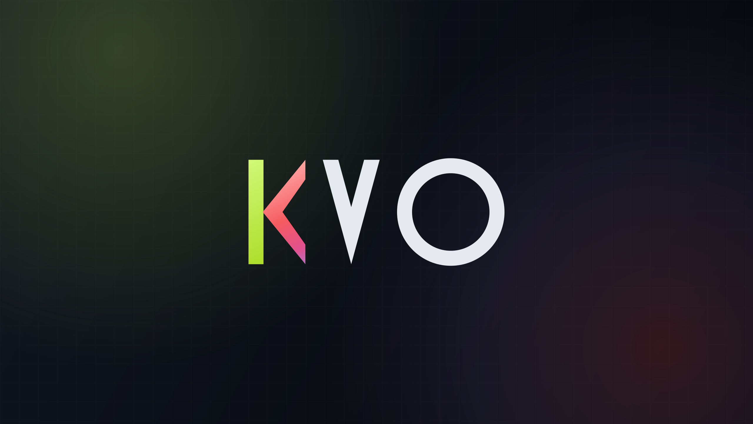
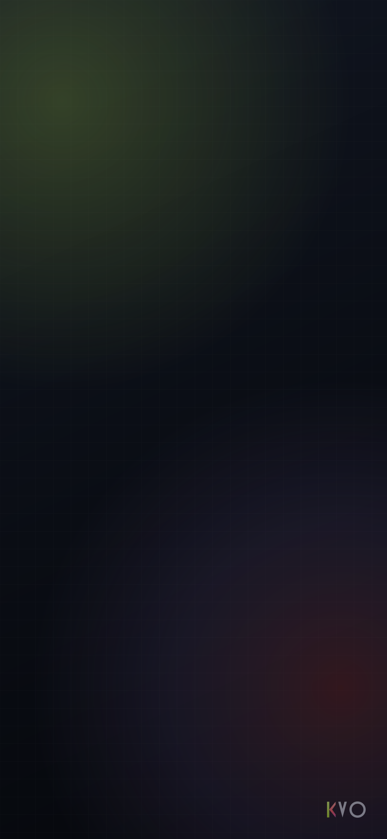
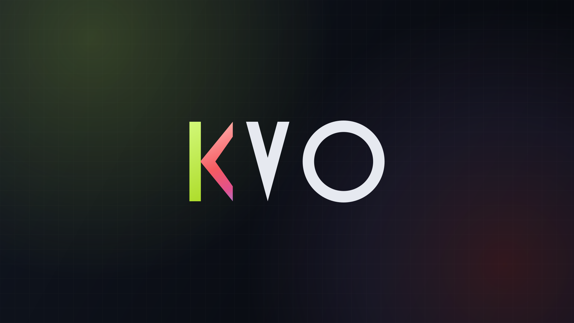
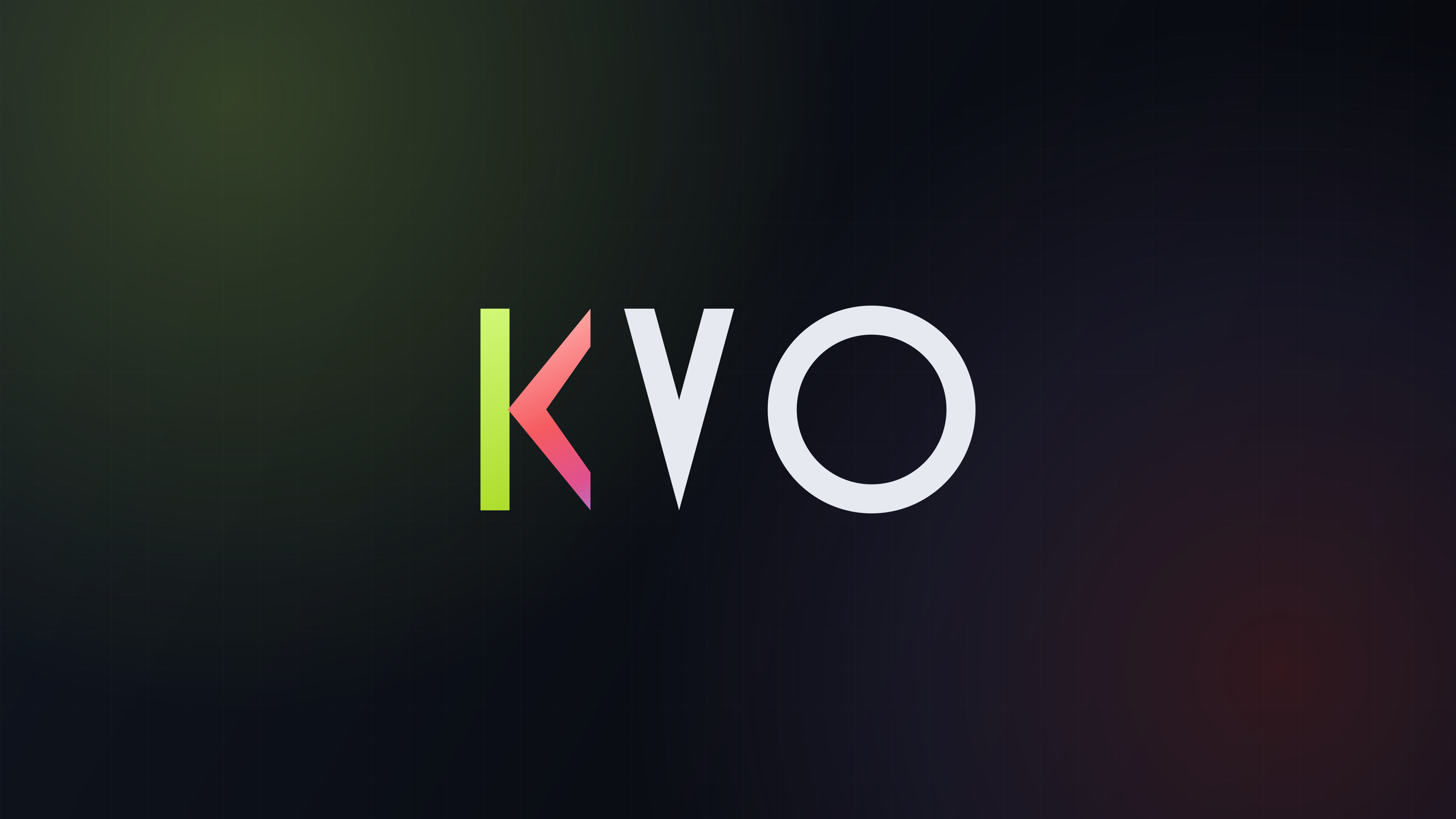
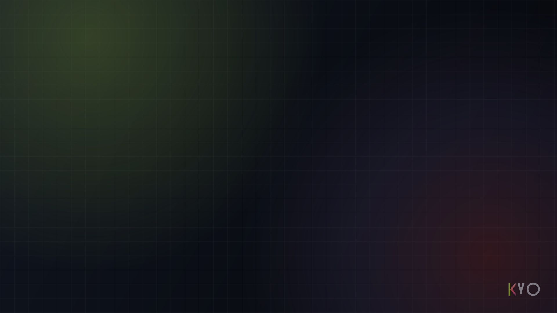
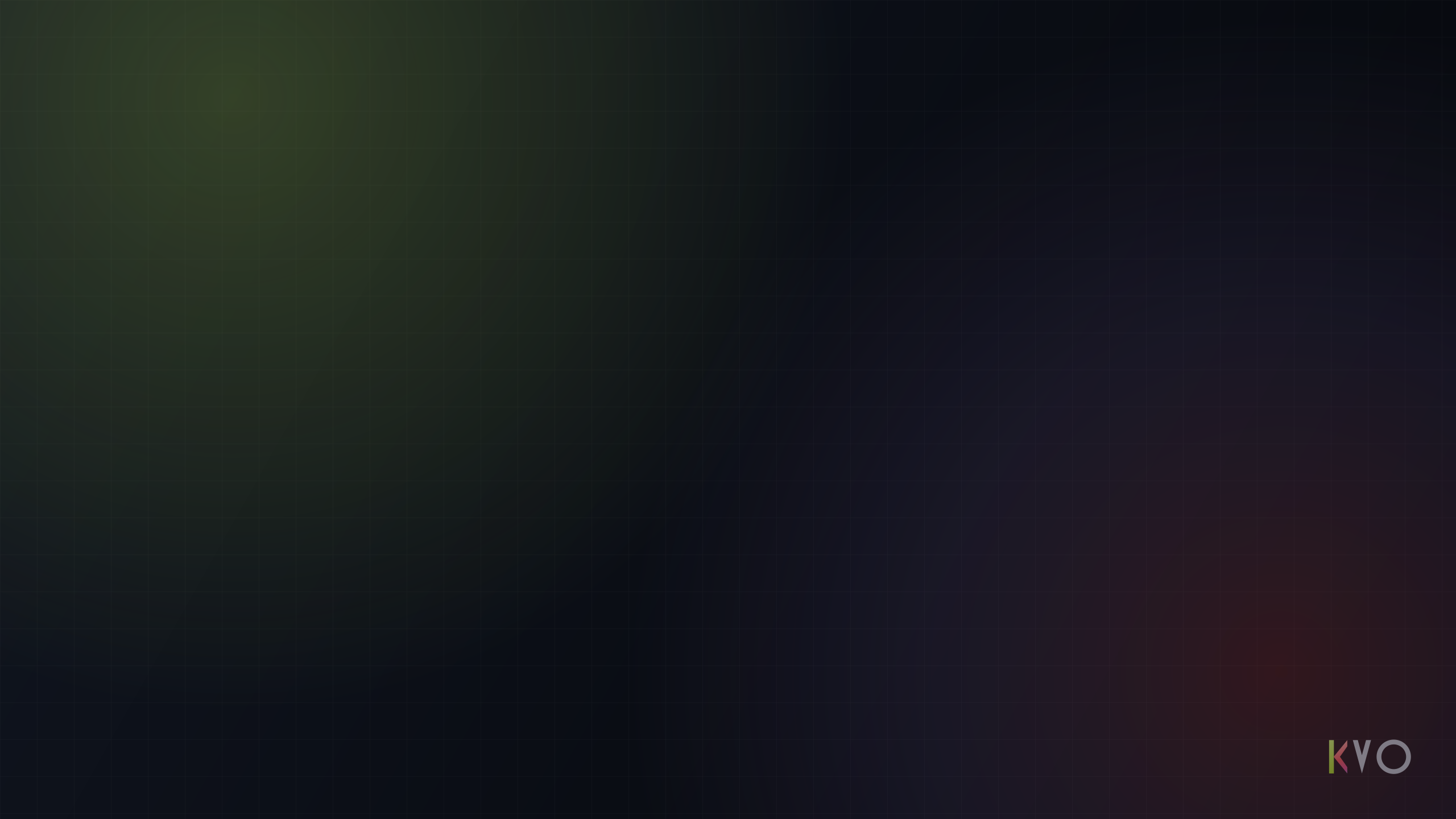
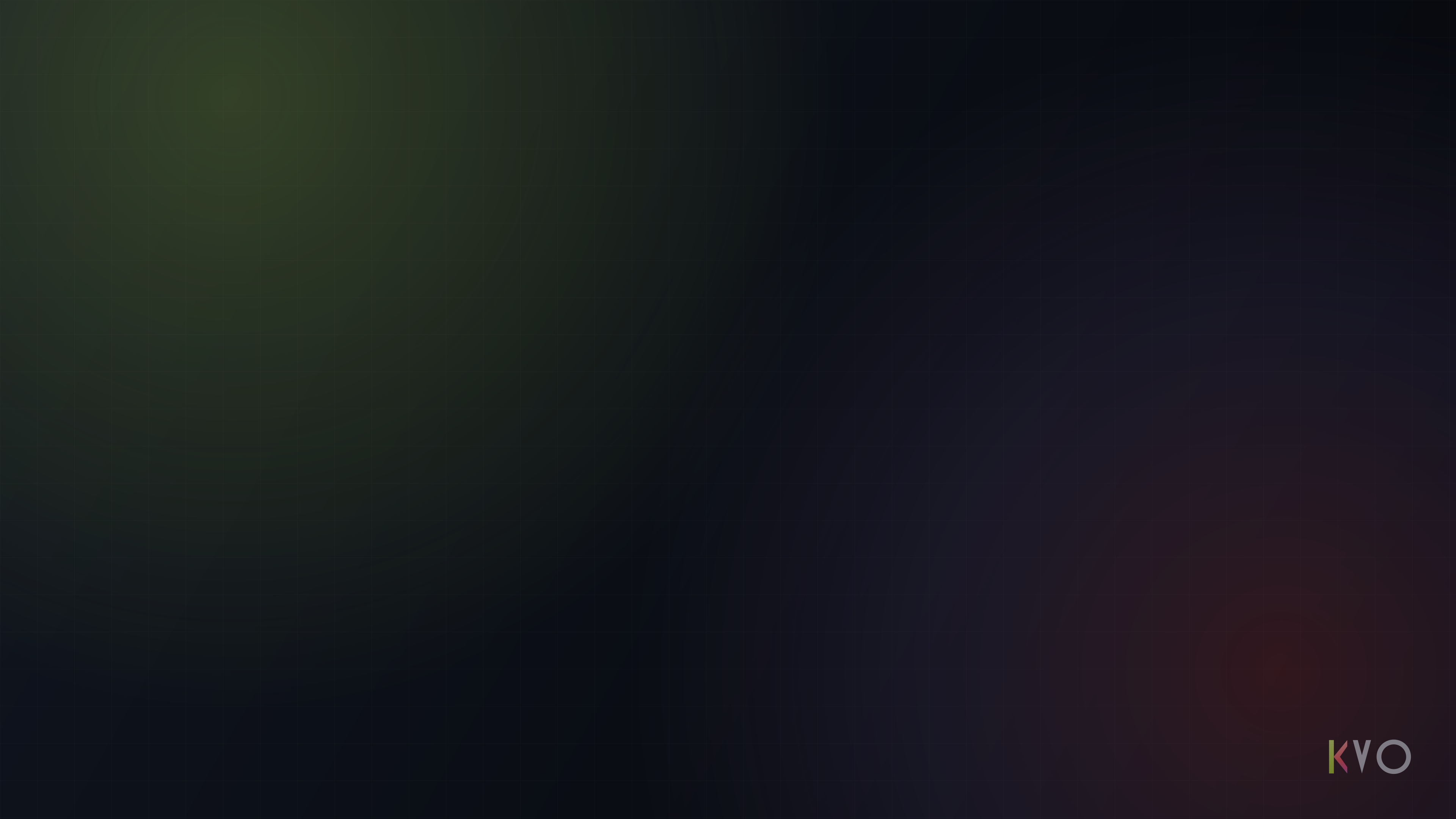
Lime and parelmoer fields under a fine grid, with the monogram set in the corner or centred. Take one — they are mine to give.
Velden van lime en parelmoer onder een fijn raster, met het monogram in de hoek of gecentreerd. Neem er een — ze zijn van mij om weg te geven.
Full documentationVolledige documentatie
Read the system itselfLees het systeem zelf
Nacre runs this site
Every page you have seen here uses it — including the day/night switch in the header.
Nacre draagt deze site
Elke pagina die je hier zag gebruikt het — ook de dag/nacht-knop in de header.